
What do Dell, Toblerone, Apple, and Amazon have in common? Here are the hidden secrets in their logos and what they stand for.
Ray-Ban
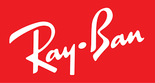
You can believe that the firm name is shown in a script font for a more fashionable look in the logo. Famous for their adored sunglasses, Ray-Ban actually features a subtly rendered pair in the letter “B.” (just turn your head sideways to see it).
Hyundai
Isn’t that a jazzy-looking “H” for Hyundai? We believed that it was angled to imply speed. This logo is intended to depict the shaking hands of two persons, one of whom is a salesperson and the other is a happy vehicle customer.
Gillette
This font has a sporty appearance, and the slanted design gives the impression of speed. Those tilted letters are positioned that way to appear “razor-sharp.” To represent the brand’s signature product, the “G” and the “I” have been chopped. Also read- History Of Wifi: When and Who?
Chick-fil-A
Some people say the company name, which is written in vibrant red cursive, is simply adorable and somewhat rural. Although the typeface has undoubtedly become a part of the Chick-fil-A brand, you should still notice the chicken in the “C.” Perfect for a well-known fast-food restaurant franchise that only serves chicken.
IBM
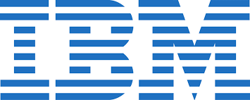
With its horizontal lines and everything, the IBM logo appears to have been created on a simple printer. But that’s not what the logo is meant to represent. The equal sign, which represents IBM’s commitment to equality, is really symbolised by those horizontal lines.
Adidas
Most people concentrate on the brand name when it is written in strong, lowercase letters: “Adidas.” The diagonal stripes, however, have significance because they are meant to resemble a mountain—the kind of peak that top athletes would push themselves to conquer despite all difficulties.
Unilever
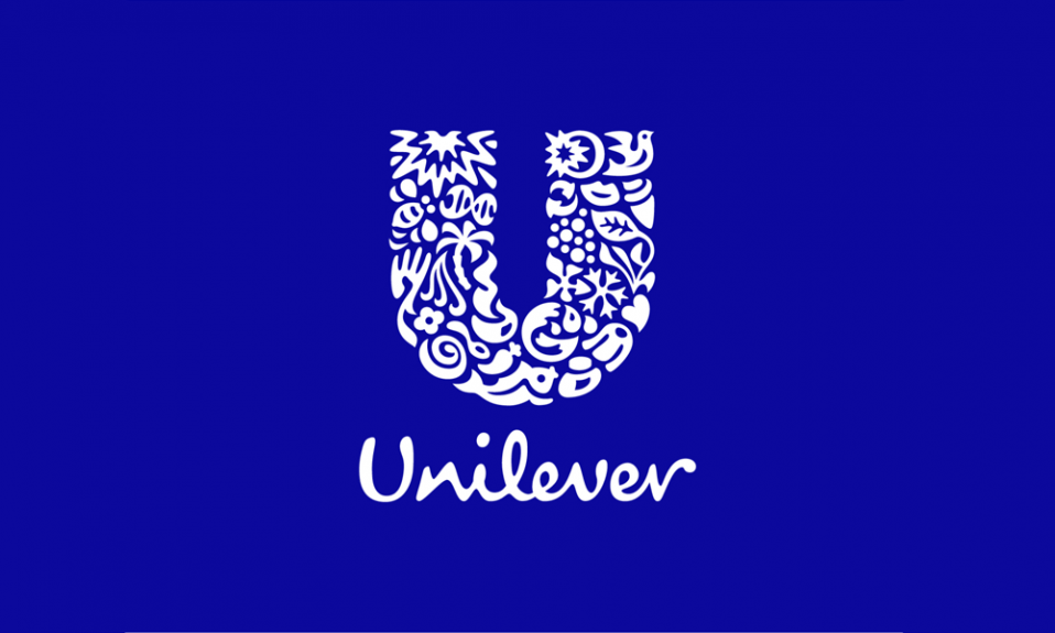
You’d think that, given how ubiquitous the Unilever logo is, we would have given this intriguing design a closer look. Most people just pay attention to the letter “U” and its ornamental theme. However, if you look closer, you’ll see that the Unilever “U” employs symbols that are connected to its wide range of product offers. That’s a very amazing way to sum up what the business does under its broad umbrella.
Cisco
This logo appears to be quite straightforward at first. Under a line pattern, the name of the networking firm is obvious as day. But this logo is more complex than it first appears to be. In honour of Cisco’s namesake San Francisco, Canva claims that the blue stripes stand in for an electromagnet and the Golden Gate Bridge. You cannot unsee the bridge once you have seen it in those lines.
Formula One
With the powerful “F” and modern red flame design in this early Formula One logo, you get a strong racing flair and perhaps sense the urge for speed. But Formula One also makes good use of negative space, much like the FedEx emblem does. Take a look between the “F” and the flames in red. White makes it easy to see the “1” in Formula One. Also read- Thomas Edison’s Secret Trick to Maximize His Creativity by Falling Asleep
With a capital “P” positioned in the centre of a vivid red circle, you may believe that this logo is very straightforward. However, the “P” in the company’s logo also has an image of a map pin. One of the Pinterest logo’s creators reportedly didn’t want to include a representation of a real pin, but the finished design came together naturally.
Hershey’s Kisses
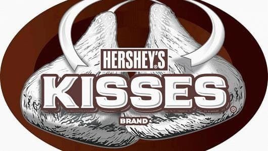
If you examine the logo closely, you’ll see that it contains more than just two kisses. Three are present! In the word “Kisses,” look between the “K” and the “I.” A sideways kiss is firmly positioned between the two letters if you turn your head to the left.
LG
Are the letters L and G skillfully combined to form a smiley face, perhaps that of a pleased LG customer? Nope. Some people have noticed that the smiling face really resembles a modified version of Pacman if you tilt your head to the side. Maybe a tribute to the iconic figure from arcade games and the early era of personal technology? That is just conjecture. The planet, the future, youth, humanity, and technology are represented by the logo, claims LG.
Wikipedia
Wikipedia is a vast repository of knowledge, which explains why the site’s confusing logo is incomplete. The unfinished globe, which is constructed from jigsaw pieces with characters from multiple languages, symbolises the “incomplete ness” of the company’s goal to be the go-to information gateway as well as the notion that a website based on user contributions can never be finished.
Dell
The Dell logo’s sideways E is more than simply a unique method to differentiate it from other brands. In a statement, Michael Dell stated that his company’s mission was to “flip the world on its ear.” He allegedly began with an E.
Toblerone
If you’ve ever purchased this delectable Swiss chocolate bar, you’ve probably seen the mountain on its emblem. But hold on, what’s that up there on the mountain’s left side? It’s a bear, that much is certain. The bear is the renowned symbol of Bern, Switzerland, the city that gave birth to Toblerone.
FedEx
It’s simple to overlook the secret message because the FedEx logo first appears to be very ordinary. Look at the arrow moving forward in the gap between the E and the x; it may be intended to imply a swift and precise delivery.
Apple
Why does the famous logo of the IT giant have a bite eaten out of it? The explanation is rather practical. To make a smaller logo still resemble an apple and not a cherry, the designer created the bite mark for scale.
Also read- How did Google get its name?