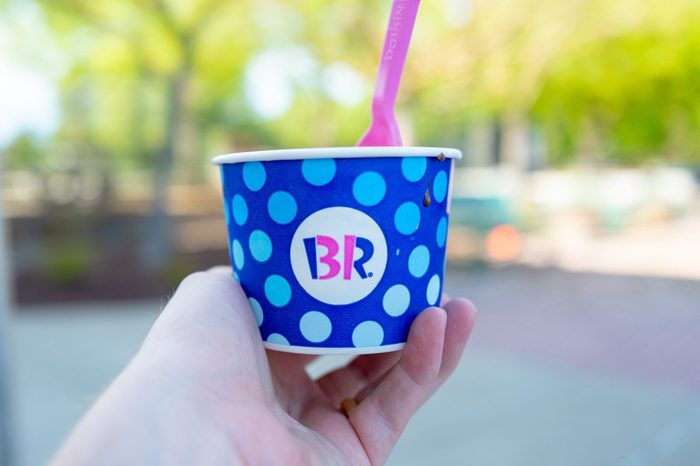
What ingenious “secret” can you find in the Baskin-Robbins logo?
The well-known ice cream shop Baskin Robbins is renowned for its extensive menu of mouthwatering flavors and pink spoons. But have you ever given their logo a closer look? It has a secret message, and it’s not the only logo with a concealed image. You might not be aware of it, but there are a lot of hidden messages in logos of businesses like Starbucks and 7-Eleven. What therefore is concealed in the Baskin-Robbins logo?
The history of the Baskin Robbins logo
There is ice cream in this family. Irv Robbins launched his own ice cream business in Pasadena a year after his brother-in-law, Burt Baskin, opened Burton’s Ice Cream Shop in Glendale, California, in 1945. It should come as no surprise that the two merged their enterprises quickly.
In 1953, Baskin and Robbins founded Baskin Robbins. They were 31 kinds available, so customers could conceivably stop by every day of the month to try a different taste. Offering as many flavors as they did at the time was unusual, therefore they wanted to boast about it in their logo and on their storefronts. “31” was proudly written over the word “Baskin Robbins Ice Cream,” standing out from the name.
Before 1991, when the words “Baskin” and “Robbins” were sandwiched between the number 31, this was the company’s iconic symbol. They also debuted the pink and blue color combination at this time.
The design was then updated in 2006, but the number 31 was kept; it was simply a little more subdued. Can you perceive it now that you are aware of that? The number 31 is made up of the pink portions of the B and R. Find out why red is used in so many brands (such as the Coca-Cola logo) and how colors affect humans.
Also Read – Hidden Messages Behind Company Logos You Never Knew
Where does the 31 currently appear in the Baskin-Robbins logo?
The Baskin Robbins logo underwent its most recent redesign since 2006 in 2022. The new logo is a more serious variation of the old one. The font is a little bit more contemporary, and the designers have replaced the blue with brown. But the significant number 31 is still visible in the emblem. The pink portion of the letters B and R are made up of the 31 much like the previous logo. What do you see? Baskin-Robbins has actually produced over 1,000 kinds as of today, so the number of flavors may not be as astounding as it was all those years ago, but it still plays a significant role in the company’s history.
It’s acceptable if you were preoccupied with your ice cream and missed this amusing oddity. We also were. See how your personality qualities relate to your preferred ice cream flavor after that.
Also Read – Famous Brand Names & Their Full Forms You Probably Didn’t Know


